



Why Your Release Looks Like Five Different Projects
Your cover art was designed in one sitting, months before release. Your pre-save graphic was thrown together the week you set the release date. Your social templates came from whatever app you used at the time. Your press photos were shot a year ago for a different era of your sound. None of it was planned to sit next to the others, but by release day, it all lands in front of the same fan within a few scrolls of each other.
If none of it looks like it belongs to the same project, that mismatch is doing quiet damage before anyone has even pressed play.
Why This Matters Right Now
Fans rarely encounter a release in one clean sequence anymore. They might see a clip on their feed, then the cover art on a streaming homepage, then a press photo on a blog, all within the same afternoon and in no particular order. Every one of those moments is a chance to reinforce who you are as an artist or label, or a chance to look like three separate accounts got mixed together.
Consistency is not about being visually boring. It is about making sure that whichever piece of content a fan sees first, they recognise the next one as belonging to the same story. That recognition is what builds a following you do not have to reintroduce yourself to every single release.
The Checklist: Run This Before Any Release Goes Out
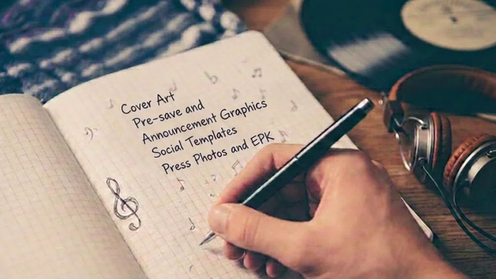
Cover Art
Your cover art sets the visual language for everything else, so start here and work outward.
- Does the colour palette match what you plan to use across social and press assets, or is it a one off?
- Does the typography style (if any appears on the cover) match your logo and other release materials?
- Would this cover still feel recognisably “you” if someone saw it without your name attached?
Pre-save and Announcement Graphics
These are usually made in a rush, close to the announcement date, which is exactly why they drift furthest from the rest of the campaign.
- Does the announcement graphic pull colours or imagery directly from the cover art, rather than introducing a new palette?
- Is your logo or artist name presented the same way it appears everywhere else?
- If you are using a template tool, have you customised it enough that it does not look identical to a hundred other artists’ announcement posts?
Social Templates
Recurring templates for countdowns, lyric posts, and behind the scenes content are useful for consistency, but only if they are built once and reused deliberately.
- Do your templates use the same fonts and colours as your cover art and announcement graphics?
- Are you using more than one template style across a single campaign without a reason to?
- Have you checked current size specifications for each platform before exporting? Requirements shift, so it is worth confirming against a source such as Meta’s official Instagram image size guide rather than relying on memory.
Press Photos and EPK
Press photos often get shot separately from a campaign and then reused long after they stop reflecting your current sound or visual direction.
- Do your current press photos still match the tone of the music you are releasing now?
- Is the same photo set used consistently across your EPK, streaming profiles, and press outreach, rather than a different image sent to each outlet?
- If a journalist or blog pulled one image at random, would it still feel aligned with your cover art and social content?
Video and Short Form Content
Short clips are often the first thing a new listener sees, which makes them worth checking as closely as the cover art itself.
- Do your video thumbnails, captions, or on screen text use the same colours and fonts as the rest of the campaign?
- Is there a visual cue, a colour, a symbol, a recurring shot style, that a viewer would associate with you specifically?
How to Actually Run the Audit
Pick one asset, usually the cover art, as your single visual reference. Lay every other piece of content for the release next to it, physically or in a folder on your desktop, and ask whether a stranger would guess they belong together. Do this at least a week before release day, while there is still time to adjust a graphic or reshoot a photo, rather than the night before when the only option is to publish it as is.
For labels managing more than one artist, this audit matters even more. A visual reference for each artist keeps releases distinct from each other while still feeling like they come from a label with a clear identity behind it.
Get Your Next Release Looking Like One Project, Not Five
Running this audit yourself catches the obvious mismatches, but keeping every asset aligned across an entire campaign, from announcement to release day, takes ongoing attention most artists and labels do not have spare time for. MN2S Label Services can help you with label distribution and take this off your plate. Get in touch to talk through your next release.